By default, the action bar appears at the top of your activity window,
slightly reducing the amount of space available for the rest of your activity's layout.
If, during the course of user interaction, you want to hide and show the action bar, you can do so
by calling hide() and
show() on the ActionBar. However,
this causes your activity to recompute and redraw the layout based on its new size.
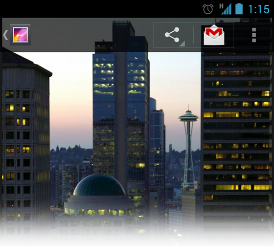
Figure 1. Gallery's action bar in overlay mode.
To avoid resizing your layout when the action bar hides and shows, you can enable overlay mode for the action bar. When in overlay mode, your activity layout uses all the space available as if the action bar is not there and the system draws the action bar in front of your layout. This obscures some of the layout at the top, but now when the action bar hides or appears, the system does not need to resize your layout and the transition is seamless.
Tip: If you want your layout to be partially visible behind the action bar, create a custom style for the action bar with a partially transparent background, such as the one shown in figure 1. For information about how to define the action bar background, read Styling the Action Bar.
Enable Overlay Mode
To enable overlay mode for the action bar, you need to create a custom theme that
extends an existing action bar theme and set the android:windowActionBarOverlay property to
true.
For Android 3.0 and higher only
If your
minSdkVersion
is set to 11 or higher, your custom theme should use
Theme.Holo theme (or one of its descendants) as your parent
theme. For example:
<resources>
    <!-- the theme applied to the application or activity -->
    <style name="CustomActionBarTheme"
           parent="@android:style/Theme.Holo">
        <item name="android:windowActionBarOverlay">true</item>
    </style>
</resources>
For Android 2.1 and higher
If your app is using the Support Library for compatibility on devices
running versions lower than Android 3.0, your custom theme should use
Theme.AppCompat theme
(or one of its descendants) as your parent theme. For example:
<resources>
    <!-- the theme applied to the application or activity -->
    <style name="CustomActionBarTheme"
           parent="@android:style/Theme.AppCompat">
        <item name="android:windowActionBarOverlay">true</item>

        <!-- Support library compatibility -->
        <item name="windowActionBarOverlay">true</item>
    </style>
</resources>
Also notice that this theme includes two definitions for the windowActionBarOverlay
style: one with the android: prefix and one without. The one with the android:
prefix is for versions of Android that include the style in the platform and the one
without the prefix is for older versions that read the style from the Support Library.
Specify Layout Top-margin
When the action bar is in overlay mode, it might obscure some of your layout that should
remain visible. To ensure that such items remain below the action bar at all times,
add either margin or padding to the top of the view(s)
using the height specified by actionBarSize. For example:
<RelativeLayout xmlns:android="http://schemas.android.com/apk/res/android"
    android:layout_width="match_parent"
    android:layout_height="match_parent"
    android:paddingTop="?android:attr/actionBarSize">
    ...
</RelativeLayout>
If you're using the Support Library for the action bar, you need to remove the
android: prefix. For example:
<!-- Support library compatibility -->
<RelativeLayout xmlns:android="http://schemas.android.com/apk/res/android"
    android:layout_width="match_parent"
    android:layout_height="match_parent"
    android:paddingTop="?attr/actionBarSize">
    ...
</RelativeLayout>
In this case, the ?attr/actionBarSize value without the
prefix works on all versions, including Android 3.0 and higher.