This lesson teaches you to
- Add the Wearable UI Library
- Specify Different Layouts for Square and Round Screens
- Use a Shape-Aware Layout
You should also read
Video
Wearables use the same layout techniques as handheld Android devices, but need to be designed with specific constraints. Do not port functionality and the UI from a handheld app and expect a good experience. For more information on how to design great wearable apps, read the Android Wear Design Guidelines.
When you create layouts for Android Wear apps, you need to account for devices with square and round screens. Any content placed near the corners of the screen may be cropped on round Android Wear devices, so layouts designed for square screens do not work well on round devices. For a demonstration of this type of problem, see the video Full Screen Apps for Android Wear.
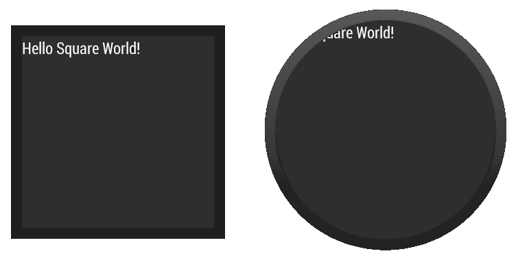
For example, figure 1 shows how the following layout looks on square and round screens:

Figure 1. Demonstration of how a layout designed for square screens does not work well on round screens.
<LinearLayout xmlns:android="http://schemas.android.com/apk/res/android"
    xmlns:tools="http://schemas.android.com/tools"
    android:layout_width="match_parent"
    android:layout_height="match_parent"
    android:orientation="vertical">

    <TextView
        android:id="@+id/text"
        android:layout_width="wrap_content"
        android:layout_height="wrap_content"
        android:text="@string/hello_square" />
</LinearLayout>
The text does not display correctly on devices with round screens.
The Wearable UI Library provides two different approaches to solve this problem:
- Define different layouts for square and round devices. Your app detects the shape of the device screen and inflates the correct layout at runtime.
- Use a special layout included in the library for both square and round devices. This layout applies different window insets depending on the shape of the device screen.
You typically use the first approach when you want your app to look different depending on the shape of the device screen. You use the second approach when you want to use a similar layout on both screen shapes without having views cropped near the edges of round screens.
Add the Wearable UI Library
Android Studio includes the Wearable UI Library on your wear module by default
when you use the Project Wizard. To compile your project with this library, ensure that the
Extras > Google Repository package is installed in
the Android SDK manager and that the following dependency is included in the
build.gradle file of your wear module:
dependencies {
    compile fileTree(dir: 'libs', include: ['*.jar'])
    compile 'com.google.android.support:wearable:+'
    compile 'com.google.android.gms:play-services-wearable:+'
}
The 'com.google.android.support:wearable' dependency is required to implement
the layout techniques shown in the following sections.
Browse the API reference documentation for the Wearable UI Library classes.
Specify Different Layouts for Square and Round Screens
The WatchViewStub class included in the Wearable UI Library lets you specify
different layout definitions for square and round screens. This class detects the screen shape
at runtime and inflates the corresponding layout.
To use this class for handling different screen shapes in your app:
- Add
WatchViewStubas the main element of your activity's layout. - Specify a layout definition file for square screens with the
rectLayoutattribute. - Specify a layout definition file for round screens with the
roundLayoutattribute.
Define your activity's layout as follows:
<android.support.wearable.view.WatchViewStub
    xmlns:android="http://schemas.android.com/apk/res/android"
    xmlns:app="http://schemas.android.com/apk/res-auto"
    xmlns:tools="http://schemas.android.com/tools"
    android:id="@+id/watch_view_stub"
    android:layout_width="match_parent"
    android:layout_height="match_parent"
    app:rectLayout="@layout/rect_activity_wear"
    app:roundLayout="@layout/round_activity_wear">
</android.support.wearable.view.WatchViewStub>
Inflate this layout in your activity:
@Override
protected void onCreate(Bundle savedInstanceState) {
    super.onCreate(savedInstanceState);
    setContentView(R.layout.activity_wear);
}
Then create different layout definition files for square and round screens. In this example,
you need to create the files res/layout/rect_activity_wear.xml and
res/layout/round_activity_wear.xml. You define these layouts in the same way that
you create layouts for handheld apps, but taking into account the constraints of wearable devices.
The system inflates the correct layout at runtime depending on the screen shape.
Accessing layout views
The layouts that you specify for square or round screens are not inflated until
WatchViewStub detects the shape of the screen, so your app cannot access their views
immediately. To access these views, set a listener in your activity to be notified when
the shape-specific layout has been inflated:
@Override
protected void onCreate(Bundle savedInstanceState) {
    super.onCreate(savedInstanceState);
    setContentView(R.layout.activity_wear);

    WatchViewStub stub = (WatchViewStub) findViewById(R.id.watch_view_stub);
    stub.setOnLayoutInflatedListener(new WatchViewStub.OnLayoutInflatedListener() {
        @Override public void onLayoutInflated(WatchViewStub stub) {
            // Now you can access your views
            TextView tv = (TextView) stub.findViewById(R.id.text);
            ...
        }
    });
}
Use a Shape-Aware Layout

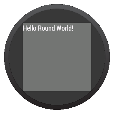
Figure 2. Window insets on a round screen.
The BoxInsetLayout class included in the Wearable UI Library extends
FrameLayout and lets you define a single layout that works for both square
and round screens. This class applies the required window insets depending on the screen shape
and lets you easily align views on the center or near the edges of the screen.
The gray square in figure 2 shows the area where BoxInsetLayout can automatically
place its child views on round screens after applying the required window insets. To be displayed
inside this area, children views specify the layout_box atribute with these values:
- A combination of
top,bottom,left, andright. For example,"left|top"positions the child's left and top edges inside the gray square in figure 2. - The
allvalue positions all the child's content inside the gray square in figure 2.
On square screens, the window insets are zero and the layout_box attribute is
ignored.

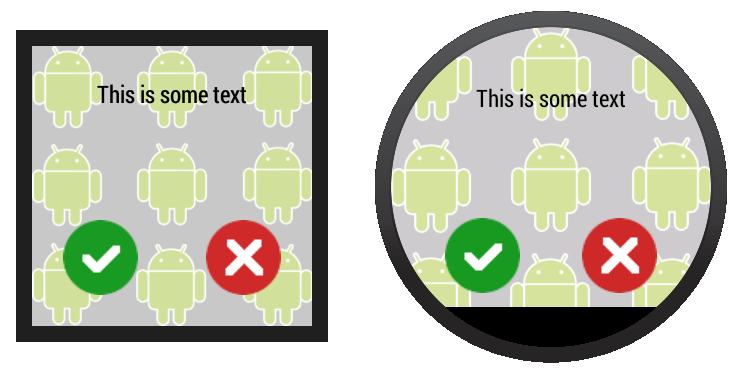
Figure 3. A layout definition that works on both square and round screens.
The layout shown in figure 3 uses BoxInsetLayout and works on square and
round screens:
<android.support.wearable.view.BoxInsetLayout
    xmlns:android="http://schemas.android.com/apk/res/android"
    xmlns:app="http://schemas.android.com/apk/res-auto"
    android:background="@drawable/robot_background"
    android:layout_height="match_parent"
    android:layout_width="match_parent"
    android:padding="15dp">

    <FrameLayout
        android:layout_width="match_parent"
        android:layout_height="match_parent"
        android:padding="5dp"
        app:layout_box="all">

        <TextView
            android:gravity="center"
            android:layout_height="wrap_content"
            android:layout_width="match_parent"
            android:text="@string/sometext"
            android:textColor="@color/black" />

        <ImageButton
            android:background="@null"
            android:layout_gravity="bottom|left"
            android:layout_height="50dp"
            android:layout_width="50dp"
            android:src="@drawable/ok" />

        <ImageButton
            android:background="@null"
            android:layout_gravity="bottom|right"
            android:layout_height="50dp"
            android:layout_width="50dp"
            android:src="@drawable/cancel" />
    </FrameLayout>
</android.support.wearable.view.BoxInsetLayout>
Notice the parts of the layout marked in bold:
-
android:padding="15dp"This line assigns padding to the
BoxInsetLayoutelement. Because the window insets on round devices are larger than 15dp, this padding only applies to square screens. -
android:padding="5dp"This line assigns padding to the inner
FrameLayoutelement. This padding applies to both square and round screens. The total padding between the buttons and the window insets is 20 dp on square screens (15+5) and 5 dp on round screens. -
app:layout_box="all"This line ensures that the
FrameLayoutelement and its children are boxed inside the area defined by the window insets on round screens. This line has no effect on square screens.