This lesson teaches you to
You should also read
The 2D Picker pattern in Android Wear allows users to navigate and choose from a set of items shown as pages. The Wearable UI Library lets you easily implement this pattern using a page grid, which is a layout manager that allows users to scroll vertically and horizontally through pages of data.
To implement this pattern, you add a GridViewPager element to the layout
of your activity and implement an adapter that provides a set of pages by extending
the FragmentGridPagerAdapter class.
Note: The GridViewPager sample in the Android SDK
demonstrates how to use the GridViewPager layout in your apps. This sample is
located in the android-sdk/samples/android-20/wearable/GridViewPager directory.
Add a Page Grid
Add a GridViewPager element to your layout definition as follows:
<android.support.wearable.view.GridViewPager
    xmlns:android="http://schemas.android.com/apk/res/android"
    android:id="@+id/pager"
    android:layout_width="match_parent"
    android:layout_height="match_parent" />
You can use any of the techniques described in Defining Layouts to ensure that your 2D picker works on both round and square devices.
Implement a Page Adapter
A page adapter provides a set of pages to populate a GridViewPager component. To
implement this adapter, you extend the FragmentGridPageAdapter class from the
Wearable UI Library
For example, the GridViewPager sample in the Android SDK contains the following adapter implementation that provides a set of static cards with custom background images:
public class SampleGridPagerAdapter extends FragmentGridPagerAdapter {

    private final Context mContext;

    public SampleGridPagerAdapter(Context ctx, FragmentManager fm) {
        super(fm);
        mContext = ctx;
    }

    static final int[] BG_IMAGES = new int[] {
            R.drawable.debug_background_1, ...
            R.drawable.debug_background_5
    };

    // A simple container for static data in each page
    private static class Page {
        // static resources
        int titleRes;
        int textRes;
        int iconRes;
        ...
    }

    // Create a static set of pages in a 2D array
    private final Page[][] PAGES = { ... };

    // Override methods in FragmentGridPagerAdapter
    ...
}
The picker calls getFragment and getBackground to retrieve the content
to display at each position of the grid:
// Obtain the UI fragment at the specified position
@Override
public Fragment getFragment(int row, int col) {
    Page page = PAGES[row][col];
    String title =
        page.titleRes != 0 ? mContext.getString(page.titleRes) : null;
    String text =
        page.textRes != 0 ? mContext.getString(page.textRes) : null;
    CardFragment fragment = CardFragment.create(title, text, page.iconRes);

    // Advanced settings (card gravity, card expansion/scrolling)
    fragment.setCardGravity(page.cardGravity);
    fragment.setExpansionEnabled(page.expansionEnabled);
    fragment.setExpansionDirection(page.expansionDirection);
    fragment.setExpansionFactor(page.expansionFactor);
    return fragment;
}

// Obtain the background image for the page at the specified position
@Override
public ImageReference getBackground(int row, int column) {
    return ImageReference.forDrawable(BG_IMAGES[row % BG_IMAGES.length]);
}
The getRowCount method tells the picker how many rows of content are
available, and the getColumnCount method tells the picker how many columns
of content are available for each of the rows.
// Obtain the number of pages (vertical)
@Override
public int getRowCount() {
    return PAGES.length;
}

// Obtain the number of pages (horizontal)
@Override
public int getColumnCount(int rowNum) {
    return PAGES[rowNum].length;
}
The adapter implementation details depend on your particular set of pages. Each page provided
by the adapter is of type Fragment. In this example, each page is a
CardFragment instance that uses one of the default card layouts. However, you can
combine different types of pages in the same 2D picker, such as cards, action icons, and custom
layouts depending on your use cases.
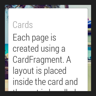
Figure 1: The GridViewPager sample.
Not all rows need to have the same number of pages. Notice that in this example the number of
colums is different for each row. You can also use a GridViewPager component to
implement a 1D picker with only one row or only one column.
GridViewPager provides support for scrolling in cards whose content does not fit
the device screen. This example configures each card to expand as required, so users can scroll
through the card's content. When users reach the end of a scrollable card, a swipe in the same
direction shows the next page on the grid, if one is available.
You can specify a custom background for each page with the getBackground() method.
When users swipe to navigate across pages, GridViewPager applies parallax
and crossfade effects between different backgrounds automatically.
Assign an adapter instance to the page grid
In your activity, assign an instance of your adapter implementation to the
GridViewPager component:
public class MainActivity extends Activity {

    @Override
    protected void onCreate(Bundle savedInstanceState) {
        super.onCreate(savedInstanceState);
        setContentView(R.layout.activity_main);
        ...
        final GridViewPager pager = (GridViewPager) findViewById(R.id.pager);
        pager.setAdapter(new SampleGridPagerAdapter(this, getFragmentManager()));
    }
}