Progress bars and activity indicators signal to users that something is happening that will take a moment.
Progress bars
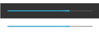
Progress bars are for situations where the percentage completed can be determined. They give users a quick sense of how much longer an operation will take.
A progress bar should always fill from 0% to 100% and never move backwards to a lower value. If multiple operations are happening in sequence, use the progress bar to represent the delay as a whole, so that when the bar reaches 100%, it doesn't return back to 0%.
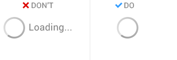
Activity indicators
Activity indicators are for operations of an indeterminate length. They ask users to wait a moment while something finishes up, without getting into specifics about what's happening behind the scenes.
Two styles are available: a bar and a circle. Each is offered in a variety of sizes, in both Holo Light and Holo Dark themes. Choose the appropriate style and size for the surrounding context. For example, the largest activity circle works well when displayed in a blank content area, but not in a smaller dialog box. Each operation should only be represented by one activity indicator.
Activity bar
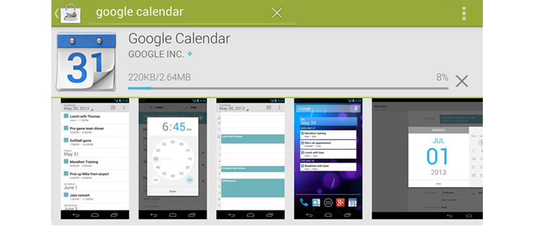
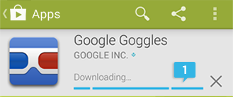
In this example, an activity bar (in Holo Dark) appears when a user first requests a download. There's an unknown period of time when the download has not yet started. As soon as the download starts, this activity bar transforms into a progress bar.
Activity circle
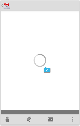
In this example, an activity circle (in Holo Light) is used in the Gmail application when a message is being loaded because it's not possible to determine how long it will take to download the email.
When displaying an activity circle, do not include text to communicate what the app is doing. The moving circle alone provides sufficient feedback about the delay, and does so in an understated way that minimizes the impact.
Custom indicators
The standard progress bar and activity indicators work well for most situations and should be used whenever possible to provide a consistent experience across Android. However, some situations may call for something more custom.
Here's an example:
In all of the Google Play apps (Music, Books, Movies, Magazines), we wanted the current download state of each item to be visible at all times at the top-level screen. These states are:
- Not downloaded
- Temporarily downloaded (automatically cached by the app)
- Permanently downloaded on the device at the user's request
We also needed to indicate progress from one download state to another, because downloading is not instantaneous.
This presented a challenge, because the Google Play apps use a variety of different layouts, and some of them are highly space-constrained. We didn't want this information to clutter the top-level screens, or compete too much with the cover art.
So we designed a custom indicator that could show all of the information in a tiny footprint, with the flexibility to appear on top of content if necessary.

The color indicates whether it's downloaded (blue) or not (gray). The appearance of the pin indicates whether the download is permanent (white, upright) or temporary (gray, diagonal). And when state is in the process of changing, progress is indicated by a moving pie chart.
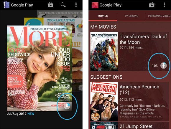
If you find that the standard indicators aren't meeting your needs (due to space constraints, state complexities), by all means design your own. Make it feel like part of the Android family by injecting some of the visual characteristics of the standard indicators. In this example, we carried over the circular shape, the same shade of blue, and the flat and simple style.