A quick look at the new patterns and styles you can use to build beautiful Android apps…
Android 5.0 Lollipop
Material design
Material design is a comprehensive guide for visual, motion, and interaction design across platforms and devices. Android 5.0 provides a new theme, new widgets for complex views, and new APIs for shadows and animations that help you implement material design patterns in your apps.
Notifications
Notifications receive important updates in Android 5.0, with material design visual changes, notification availability in the lockscreen, priority notifications, and cloud-synced notifications.
Android 4.4 KitKat
Your branding
Consistency has its place in Android, but you also have the flexibility to customize the look of your app to reinforce your brand.
Use your brand color for accent by overriding the Android framework's default blue in UI elements like checkboxes, progress bars, radio buttons, sliders, tabs, and scroll indicators.
Show your app's launcher icon and name in the action bar so that users can see it in every screen of your app.
Your Branding highlights these and other pointers on how to incorporate elements of your brand into your app's visual language — highly encouraged!
Touch feedback
Before Android KitKat, Android's default touch feedback color was a vibrant blue. Every touch resulted in a jolt of high-contrast color, in a shade that might not have mixed well with your brand's color(s).
In Android KitKat and beyond, touch feedback is subtle: when something is touched, by default its background color slightly darkens or lightens. This provides two benefits: (1) sprinkles of encouragement are more pleasant than jolts, and (2) incorporating your branding is much easier because the default touch feedback works with whatever hue you choose. Check the updated Touch Feedback page for more details.
Full screen
Android KitKat has improved support for letting your app use the entire screen, with a few different approaches to meet the varying needs of apps and content. The new Full Screen page will guide you in setting the stage for deep user engagement.
Gestures
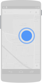
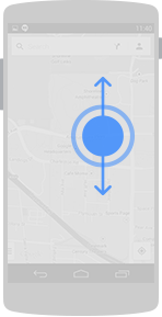
The updated Gestures page covers new and updated gestures introduced in Android KitKat: double touch drag and double touch. These gestures are used for changing the viewing size of content.
Android 4.1 Jelly Bean
Notifications
Notifications have received some notable enhancements in Android 4.1:
- Users can act on notifications immediately from the drawer
- Notifications are more flexible in size and layout
- A priority flag helps sort notifications by importance
- Notifications can be collapsed and expanded
The base notification layout has not changed, so app notifications designed for versions earlier than Jelly Bean still look and work the same. Check the updated Notifications page for more details.

Resizable Application Widgets
Widgets are an essential aspect of home screen customization, allowing "at-a-glance" views of an app's most important data and functionality right from the user's home screen. Android 4.1 introduces improved App Widgets that can automatically resize and load different content based upon a number of factors including:
- Where the user drops them on the home screen
- The size to which the user expands them
- The amount of room available on the home screen
You can supply separate landscape and portrait layouts for your widgets, which the system inflates as appropriate when the screen orientation changes. The Application Widgets page has useful details about widget types, limitations, and design considerations.

Accessibility
One of Android's missions is to organize the world's information and make it universally accessible and useful. Our mission applies to all users-including people with disabilities such as visual impairment, color deficiency, hearing loss, and limited dexterity.
The new Accessibility page provides details on how to design your app to be as accessible as possible by:
- Making navigation intuitive
- Using recommended touch target sizes
- Labeling visual UI elements meaningfully
- Providing alternatives to affordances that time out
- Using standard framework controls or enable TalkBack for custom controls
- Trying it out yourself
You can supply separate landscape and portrait layouts for your widgets, which the system inflates as appropriate when the screen orientation changes. The Widgets page has useful details about widget types, limitations, and design considerations.

Android 4.0 Ice Cream Sandwich
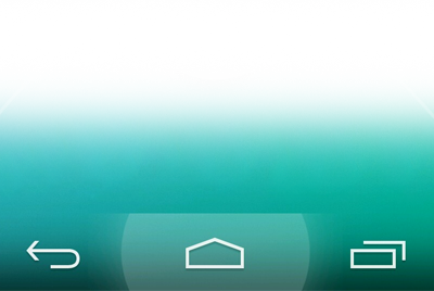
Navigation bar
Android 4.0 removes the need for traditional hardware keys on phones by replacing them with a virtual navigation bar that houses the Back, Home and Recents buttons. Read the Compatibility pattern to learn how the OS adapts to phones with hardware buttons and how pre-Android 3.0 apps that rely on menu keys are supported.

Action bar
The action bar is the most important structural element of an Android app. It provides consistent navigation across the platform and allows your app to surface actions.

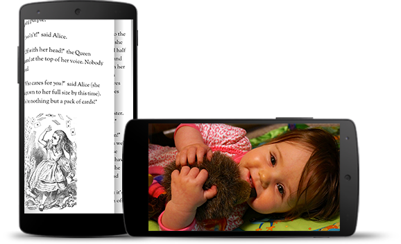
Multi-pane layouts
Creating apps that scale well across different form factors and screen sizes is important in the Android world. Multi-pane layouts allow you to combine different activities that show separately on smaller devices into richer compound views for tablets.

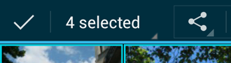
Selection
The long press gesture which was traditionally used to show contextual actions for objects is now used for data selection. When selecting data, contextual action bars allow you to surface actions.