Use illumination and dimming to respond to touches, reinforce the resulting behaviors of gestures, and indicate what actions are enabled and disabled.
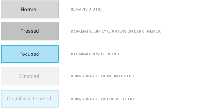
Be responsive to touches in a gentle way. Whenever a user touches an actionable area in your app, let them know the app is "listening" by providing a visual response. Make it subtle —just slightly lighter or darker than the untouched color. This provides two benefits:
- Sprinkles of encouragement are more pleasant than jolts.
- Incorporating your branding is much easier because the default touch feedback works with whatever hue you choose.
States
Communication
When your objects react to more complex gestures, help users understand what the outcome will be.
In Recents, when a user starts swiping a thumbnail left or right, it begins to dim. This helps the user understand that swiping will cause the item to be removed.
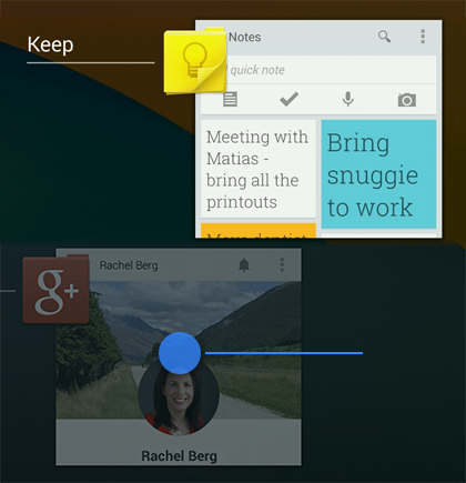
If a user attempts to scroll past the last home screen panel, the screen content tilts to the right to indicate that further navigation in this direction isn’t possible.
Boundaries
When users try to scroll past the beginning or end of a scrollable area, communicate the boundary with a visual cue. Many of Android's scrollable UI widgets, like lists and grid lists, have support for boundary feedback built in. If you’re building custom widgets, keep boundary feedback in mind and provide it from within your app.