Here are a number of design considerations to bear in mind that are particular to Android Wear.
Screen Size
Be mindful of different device sizes and shapes. Wearable devices are a form of fashion and expression for their owners, and so Android Wear supports a variety of forms. Most of the complexities of supporting these different devices is taken care of at a system level, but bear in mind different screen types when designing custom full screen apps.
Use the Android Wear emulator to test both square and round devices, and note that WatchViewStub is available to activities to detect whether a square or round device is being used.
Specific Assets Required
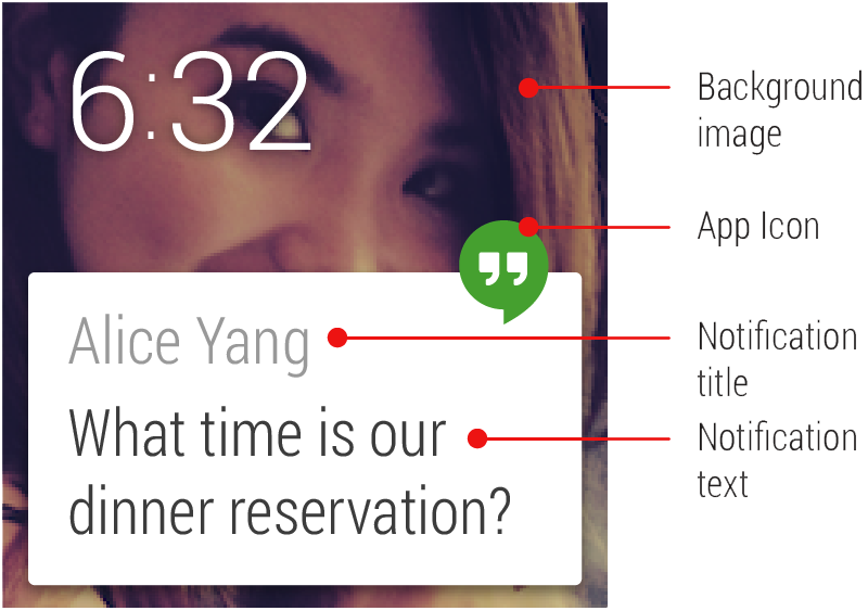
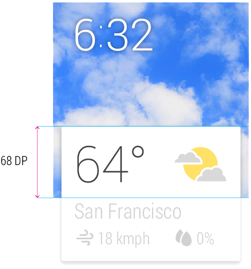
A core set of standard assets may need to be provided depending on your card design: app icon, background image or images, action icons, and action confirmation animations. Of course, your specific design may necessitate other assets. Background images should be provided in landscape format at least 600px width for notifications that include pages of cards, since the system automatically adds a parallaxing effect.
Peek Card Readability
Test your card layout to ensure that useful information is conveyed in the peek state on the Home screen. The main message of the card should be readable in the peek state, particularly for contextual cards. Content that requires an interaction to be read, for example a long message, should be cropped appropriately to provide an affordance to the user to swipe the card to read more.
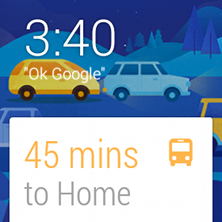
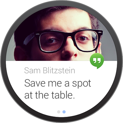
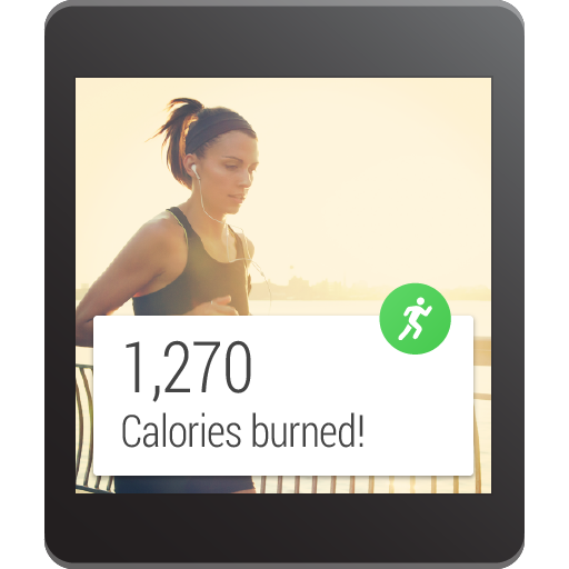
Low Information Density
Cards should be designed to be glanceable in a split second, just like reading the time on a traditional watch. In most cases a pairing of an icon and value, or a title and short caption should be enough to convey a meaningful message. Note that the background photo should also be used to convey information; backgrounds that change to reflect and support the primary message in the card work great. For example, in the case illustrated to the right, a suitable background image is chosen to reflect the severity of current traffic conditions. This is not just a nice piece of attention to detail; the background actually reinforces the message and makes the content more glanceable.
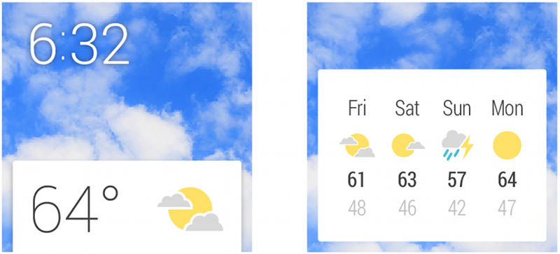
Separate Information into Chunks
In cases where additional information is absolutely necessary, don’t crowd out a card layout to the point where glanceability is affected. Instead, add an additional page (or multiple pages, if needed) to the right of the main card in the stream to which the user can swipe for more information. See also Continuing activities on phone.
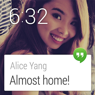
Keep Notifications to a Minimum
Don’t abuse the user’s attention. Active notifications (that is, those that cause the device to vibrate) should only be used in cases that are both timely and involve a contact, for example receiving a message from a friend. Non-urgent notifications should be silently added to the Context Stream. See also the general Android Notifications Guidelines.
Use Clear, Bold Typography
The system font is Roboto Condensed, with Regular and Light variants. Text should adhere to the size and color recommendations (see the UI Toolkit in the Downloads page). In general, text should be displayed as large as possible. Your goal should be to convey maximum information with minimum fuss.
Use Consistent Branding and Color
The app icon is used to identify and brand your application. The icon is optional but when present always appears in the same location, overhanging the top right edge of the card. Note that app icons or branding should not be displayed in the background photo, which is reserved to display an image relevant to the information on the card.
Copywrite Sparingly
Omit needless text. Design for glanceability and not for reading. Use words and phrases, not sentences. Use icons paired with values instead of text wherever possible. Text strings should be as concise as possible, and long pieces of text will be truncated to fit on a single card.
Be Discreet if Necessary
Wearables are personal devices by nature, but they are not completely private. If your notification serves content that may be particularly sensitive or embarrassing (such as notifications from a dating app or a medical status report), consider not displaying all of the information in a peek card. A notification could place the sensitive information on a second page that must be swiped to, or an application could show different amounts of detail in peek and focused card positions.
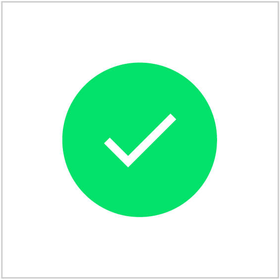
Confirmation Animations
If your app allows the user to perform an action, it is necessary to provide positive feedback. Show a generic confirmation animation or create your own. A confirmation animation is an opportunity to express your app’s character and insert a moment of delight for your user. Keep animations short (less than 1000ms) and simple. Animating the confirmation icon is an effective way of transitioning the user to a new state after completing an action.