Developer Docs
Creating a Navigation Drawer
The navigation drawer is a panel that transitions in from the left edge of the screen and displays the app’s main navigation options.
Displaying the navigation drawer
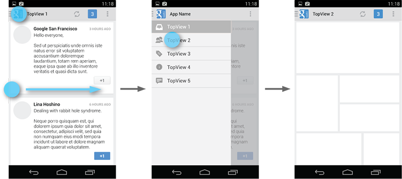
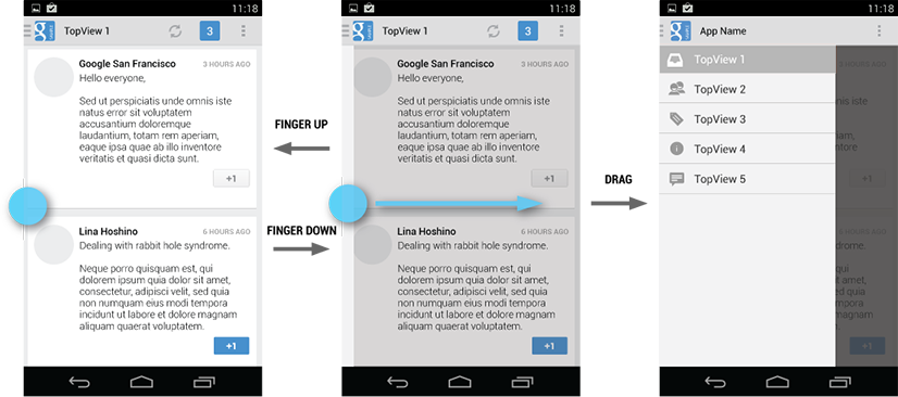
The user can bring the navigation drawer onto the screen by swiping from the left edge of the screen or by touching the application icon on the action bar.
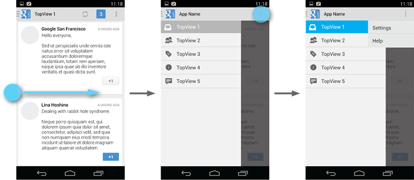
As the navigation drawer expands, it overlays the content but not the action bar. When the drawer is fully extended, the action bar adjusts its content by replacing the current action bar title with the app name and removing all actions that are contextual to the view underneath the navigation drawer. The overflow menu with the standard action items for Settings and Help remains visible.
Because they are transient, navigation drawers make views less cluttered. You can also use them at deeper levels in the navigation hierarchy, allowing users to switch to your app's most important screens from anywhere in the app.
Dismissing the navigation drawer
When the navigation drawer is expanded, the user can dismiss it in one of four ways:
- Touching the content outside the navigation drawer
- Swiping to the left anywhere on the screen (including edge swipe from right)
- Touching the app icon/title in the action bar
- Pressing Back
When to Use the Navigation Drawer
The navigation drawer is not a general replacement for top-level navigation via spinners or tabs. The structure of your app should guide your choice of which pattern to use for top-level switching. For more information on top-level switching mechanisms, see the Application Structure design pattern.
Here are some examples of where navigation drawers work best:
More than 3 top-level views
Navigation drawers are great for displaying a large number of navigation targets concurrently. Use the navigation drawer if you have more than 3 unique top-level views. If not, use fixed tabs for top-level organization to ease discovery and interaction.
Cross-navigation from lower levels
If your app requires cross-navigating between lower-level screens, consider using the navigation drawer. Because it is accessible from anywhere in the app, the drawer enables efficient navigation from lower-level screens to other important places in your app.
Deep navigation branches
If you have particularly deep branches, navigating to the top-level of your app can become repetitive and cumbersome with Up and Back alone. Since navigation drawers are accessible from anywhere in the app, navigation up to the top level is faster and more efficient.
Navigation Hubs
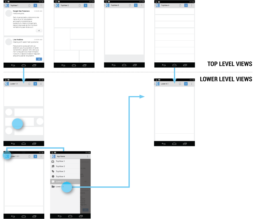
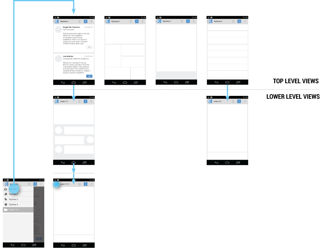
The navigation drawer is a reflection of your app’s structure and displays its major navigation hubs. Think of navigation hubs as those places in your app that a user will want to visit frequently or use as a jumping-off point to other parts of the app. At a minimum, the navigation hubs are the top-level views, since they correspond to your app’s major functional areas.
If your app’s structure is deep, you can add screens from lower levels that your users will likely visit often and make those navigation hubs as well.
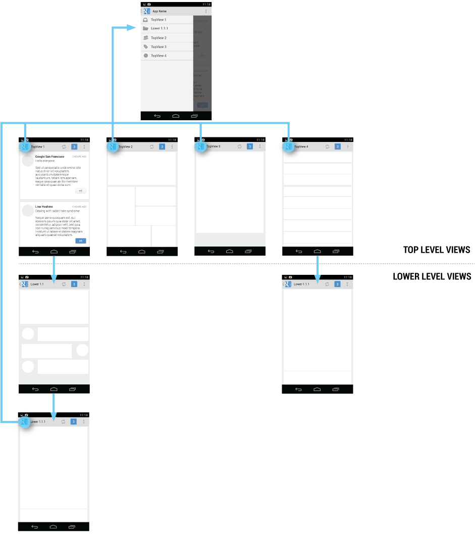
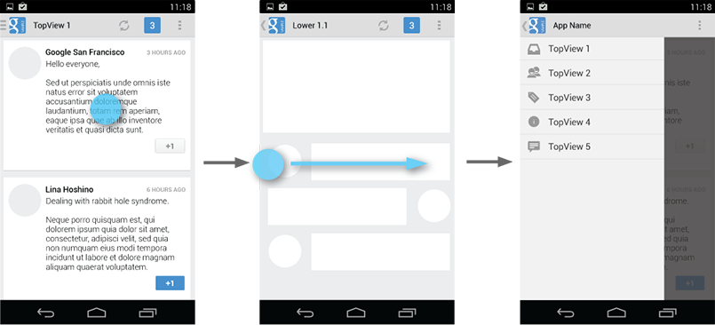
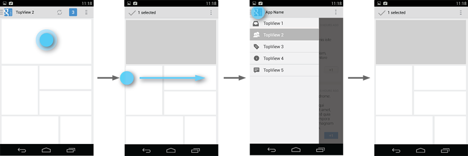
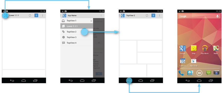
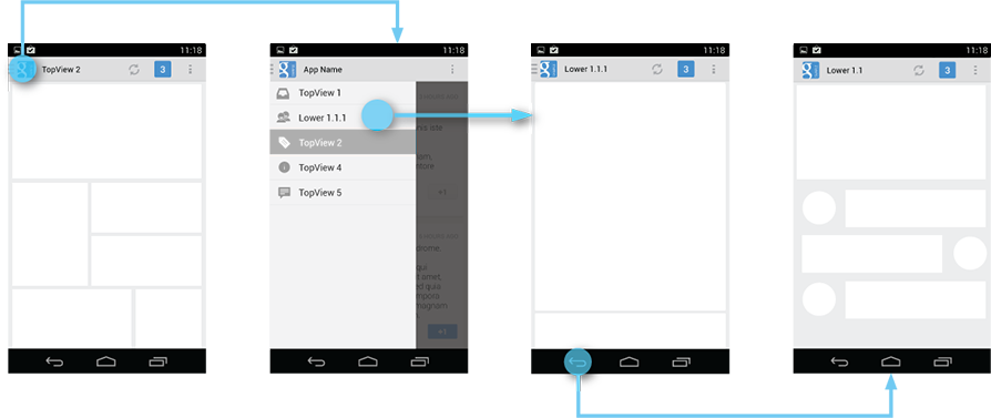
To facilitate access to the navigation drawer on navigation hubs, all screens that correspond to an entry in your navigation drawer should show the navigation drawer indicator next to the application icon in the action bar. Touching the app icon causes the navigation drawer to slide in from the left.
All other lower-level screens show the traditional Up indicator next to the application icon. The drawer is still accessible with an edge-swipe, but is not featured in the action bar.

Content of the Navigation Drawer
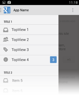
Keep the content of the navigation drawer focused on app navigation. Expose the navigation hubs of your app as list items inside the navigation drawer - one item per row.
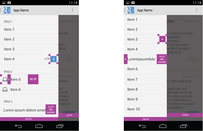
Titles, icons, and counters
You can structure navigation targets by adding titles. The titles are not interactive, but just organize navigation targets into functional topics. If you have many navigation targets, use titles to orient the user within the drawer.
Navigation targets can have optional leading icons as well as trailing counters. Use the counters to inform users about a changed state of data in the corresponding view.
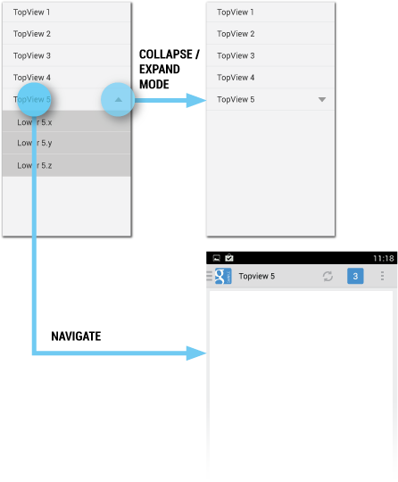
Collapsible navigation items
If you have many views with some subordinate to others, consider collapsing them into one expandable item to conserve space. The parent in the navigation drawer then turns into a split item. The left side allows navigation to the parent item’s view, and the right side collapses or expands the list of child items.
At launch, the initial state of the collapsible items is up to you. As a rule, all top-level view entries of the navigation drawer should be visible. If you have many collapsible items, consider collapsing all items to allow the user to see the top-level views in their entirety.
When the user opens the drawer from a lower-level screen, expand the associated branch of the top-level view to give a stronger sense of place and highlight navigation opportunities close to the user’s current location in the app.
Navigation Drawers and Action Bars
When the user expands the navigation drawer, the task focus switches to selecting an item from the drawer. Because the drawer does not overlay the action bar, users may not realize that the items in the action bar do not pertain to the navigation drawer.
To reduce confusion, adjust the content of the action bar to the following, once the drawer is fully expanded:
- App icon
- App name
- Remove actions from the action bar that are contextual to the underlying view (such as Create new, Refresh). You may retain actions with global scope, such as “Search”.
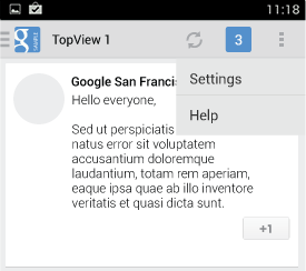
- Overflow menu with expected navigation targets, such as Settings and Help.
Actions
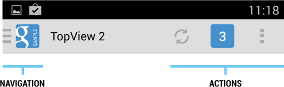
Don’t place actions in the navigation drawer. Actions belong in the action bar, and the user expects to see them there. Keep in mind that not all applications use the navigation drawer pattern. It may be tempting to expose all your app’s capabilities in a single place, but keep the bigger picture in mind. Place your actions where all apps display them.
This also applies to common navigation targets, such as access to Help or the app’s Settings. As per style guide convention Help and Settings are always located in the action overflow.
Contextual action bars
Sometimes the user will be in a state where a contextual action bar (CAB) appears instead of the app’s action bar. This typically happens when the user selects text or selects multiple items after a press-and-hold gesture. While the CAB is visible, you should still allow the user to open the navigation drawer using an edge swipe. However, replace the CAB with the standard action bar while the navigation drawer is open. When the user dismisses the drawer, re-display the CAB.
If the user navigates away from a view with selected content, deselect the content before before navigating to the new view.
Interaction Details
Introduce the user to the drawer at first use
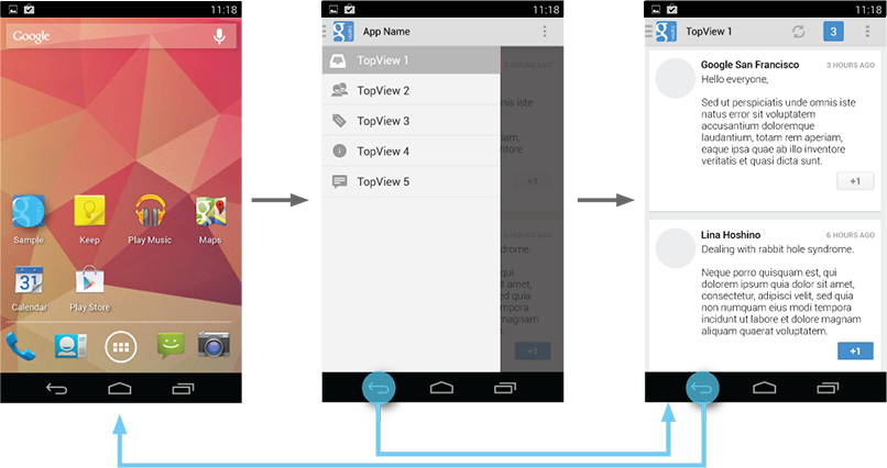
Upon first launch of your app, introduce the user to the navigation drawer by automatically opening it. This ensures that users know about the navigation drawer and prompts them to learn about the structure of your app by exploring its content. Continue showing the drawer upon subsequent launches until the user actively expands the navigation drawer manually. Once you know that the user understands how to open the drawer, launch the app with the navigation drawer closed.
Give the user a quick peek
If the user touches the very left edge of the screen (within 20 dp from the left), have the drawer peek out as soon as the finger makes contact with the display. This promotes accidental discovery and provides richer feedback.
Highlights
When you open the navigation drawer from a screen that is represented inside the drawer, highlight its entry in the drawer. Vice versa, if you open the drawer from a screen that is not listed in the drawer, none of the items of the drawer should be highlighted.
Impact of Drawer on Overall App Navigation
The navigation drawer is an alternative to other top-level navigation patterns. To make apps with navigation drawers work consistently with apps that use a tab or spinner pattern, remember that all navigation requirements for system Back and Up apply.
Pay special attention to the following situations:
System Back at the top level of the app
Touching System Back at the app’s top level never opens the navigation drawer. Instead, System Back behaves according to the navigation rules for the top level, such as navigating to the previous app within the task or navigating to the Home screen.
System Back after cross navigation to lower hierarchy levels
If the user navigates to a lower hierarchy screen from the navigation drawer and the screen has a direct parent, then the Back stack is reset and Back points to the target screen’s parent. This Back behavior is the same as when a user navigates into an app from a notification.
Style
The width of the navigation drawer depends on the content you want to display, but should be between a minimum of 240 dp and a maximum of 320 dp. The height of the individual line items should not fall below 48 dp. See the layout guideline below for recommendations on padding and spacing.
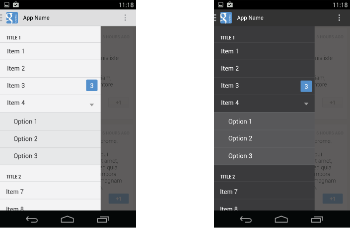
Pick the drawer background to best match your app’s theme. See the following examples for a Holo light and a Holo dark themed drawer.
Navigation Drawer Checklist
Even if you already support a similar navigation drawer, update your drawer to this pattern to make sure that:
- The action bar remains in place and adjusts its content.
- Your navigation drawer overlays the content.
- Any view represented in the drawer has a navigation drawer indicator in its action bar that allows the drawer to be opened by touching the app icon.
- You take advantage of the new visual drawer transition.
- Any view not represented in the drawer maintains the traditional Up indicator in its action bar.
- You stay in sync with the general navigation patterns for Up and Back.