As a developer of apps for TV, you should follow certain patterns to enable users to quickly understand and operate your app. This section describes recommended design patterns for TV apps.
Navigation, Focus and Selection
Users typically navigate TV devices using a directional pad (D-Pad). This type of controller limits movement to up, down, left, and right. As you design your app for TV, make sure your user interface has clear paths for two-axis navigation by aligning objects in lists and grids.
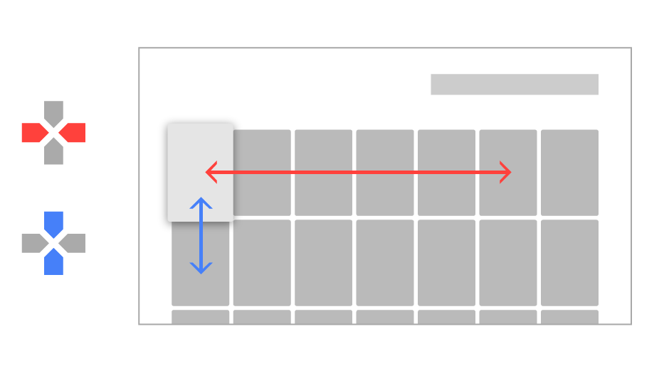
A key aspect of making your application work well with a D-pad controller is to make sure that there is always an object that is obviously in focus. Your app must clearly indicate what object is focused, so users can easily see what action they can take. Use scale, shadow brightness, opacity, animation or a combination of these attributes to help users see a focused object.
App and Game Banners
App Banners represent your app or game on the home screens of TV devices and serve and as a way for users to launch your app. Here are the specific requirements for a banner image:
- Size: 320 x 180 px, xhdpi resource
- Text should be included in the image. If your app is available in more than one language, you must provide versions of the banner image for each supported language.
See Provide a home screen banner in Get Started with TV Apps for more information.
Recommendations
The first row of the Android TV home screen displays cards for content recommended by applications. Your application provides these recommendations, as described in . For a visual overview of recommendations, see Design for Android TV.
The design elements of the recommendation card are as follows:
- Large icon
- Content title
- Content text
- Small icon
The design specifications for these elements are described below.
You can also set a background image (not shown) and the color of the card's text area in the recommendation notification. See Recommendations for more information.
Background Image
The background image also appears behind the recommendations row and fills the Android TV home screen when the user selects the recommendation card. This image should be different than the one provided for the large icon, and meet the following specifications:
- Measure 2016 x 1134 pixels (1920 x 1080 plus 5% margin for for motion)
- Must not be transparent
Note: If the background image does not meet the size requirements, the system scales it to fit.
The user interface widgets provided in the v17 leanback support library provide specific support for background images and for updating them as items gain and lose focus.
Icons
Large icon
Typically, the large icon is an image of the content for the recommendation. It appears above a colored area that contains the recommendation content title and text. This image should be different from that which you provide for the background image, and conform to the following specifications:
- Height: 176dp or more
- Minimum width: 2/3 of the height (117dp for an image 176dp in height)
- Max width: 4/3 of the height (234dp for an image 176dp in height)
- Must not be transparent
Note: If the large icon does not meet the size requirements, the system scales it to fit.
Small icon
Recommendation cards include a small icon that is imposed over a colored background. The icon and background color display at 100% opacity when the card is selected, and at 50% opacity when not selected.
Here are the requirements for recommendation small icons:
- Flat image
- Monocolor: size 16x16dp, white (#fff) icon with transparent background, PNG format
- Graphics should be centered within the icon image
Audio Feedback
Sounds on Android TV bring a cinematic quality to the interaction experience. You should consider adding sounds for user actions or to provide feedback when a user is only partially visually engaged with the screen (e.g., because they are distracted or multitasking). You should also consider using sounds as alternatives to visual messages. For example, use sounds to indicate that a user has reached the end of a list or is trying to navigate to an undefined location.