Developer Docs
Creating Apps with Material Design
Video
Introduction to Material Design
Video
Paper and Ink: The Materials that Matter
Video
Material Design in the Google I/O App
Material design is a comprehensive guide for visual, motion, and interaction design across platforms and devices. Android now includes support for material design apps. To use material design in your Android apps, follow the guidelines defined in the material design specification and use the new components and functionality available in Android 5.0 (API level 21) and above.
Android provides the following elements for you to build material design apps:
- A new theme
- New widgets for complex views
- New APIs for custom shadows and animations
For more information about implementing material design on Android, see Creating Apps with Material Design.
Material Theme
The material theme provides a new style for your app, system widgets that let you set their color palette, and default animations for touch feedback and activity transitions.
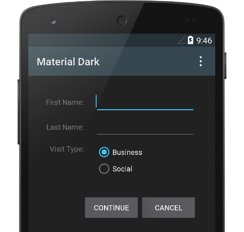
Dark material theme
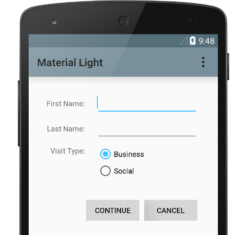
Light material theme
For more information, see Using the Material Theme.
Lists and Cards
Android provides two new widgets for displaying cards and lists with material design styles and animations:
The new RecyclerView widget is a more pluggable version of ListView
that supports different layout types and provides performance improvements.
The new CardView widget lets you display important pieces of information inside
cards that have a consistent look and feel.
For more information, see Creating Lists and Cards.
View Shadows
In addition to the X and Y properties, views in Android now have a Z property. This new property represents the elevation of a view, which determines:
- The size of the shadow: views with higher Z values cast bigger shadows.
- The drawing order: views with higher Z values appear on top of other views.
For more information, see Defining Shadows and Clipping Views.
Animations
The new animation APIs let you create custom animations for touch feedback in UI controls, changes in view state, and activity transitions.
These APIs let you:
- Respond to touch events in your views with touch feedback animations.
- Hide and show views with circular reveal animations.
- Switch between activities with custom activity transition animations.
- Create more natural animations with curved motion.
- Animate changes in one or more view properties with view state change animations.
- Show animations in state list drawables between view state changes.
Touch feedback animations are built into several standard views, such as buttons. The new APIs let you customize these animations and add them to your custom views.
For more information, see Defining Custom Animations.
Drawables
These new capabilities for drawables help you implement material design apps:
- Vector drawables are scalable without losing definition and are perfect for single-color in-app icons.
- Drawable tinting lets you define bitmaps as an alpha mask and tint them with a color at runtime.
- Color extraction lets you automatically extract prominent colors from a bitmap image.
For more information, see Working with Drawables.