Android Wear is used for micro-interactions, and so adhering to consistent design patterns that users are already accustomed to is paramount.
Cards
Cards in the stream can take slightly different forms:


- Standard cards for displaying information from a notification
- Single-action controls (such as a play/pause toggle)
- Expandable stack of cards, for grouping a set of related notifications together
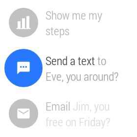
App icons
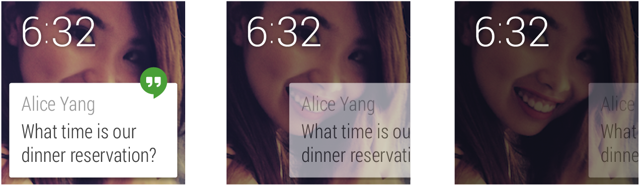
App icons appear in a fixed position overhanging the edge at the top right of the card by default for all notifications in the Context Stream. This is an opportunity for cards to be recognized as coming from a specific source. Photo backgrounds should be used only to convey information, not to brand a card. App icons are necessary only on the leftmost card; it is not necessary to add the app icon to pages.
Pages
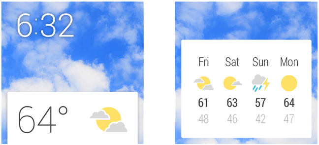
Supplementary information should be displayed on additional cards to the right of a main Context Stream card. In most cases one additional detail card should be sufficient. For example, a weather card might show the weather for the current location today, with subsequent days listed in an additional card to the right. Keep the number of detail cards as low as possible. Actions (see below) should always come after pages; don’t change the order or interleave them.
Developer Docs
Adding Pages to a Notification
Dismissing cards
Swiping from left to right on a card causes it to be dismissed from the stream. Dismissed cards may return when they next have relevant information. State is synced between the Android Wear context stream and the notifications on the Android handheld device, so dismissing from one causes an automatic dismissal from the other.
Action buttons
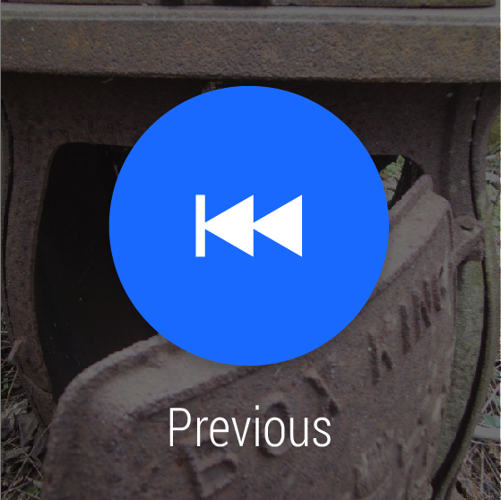
Where the user may need to take action on the information shown in a notification, you can provide action buttons. These are system-rendered buttons that appear to the right of detail cards. They consist of a white icon set on a blue system-rendered circular button and a short caption with a verb. Actions should be limited to three for a single card row.
Tapping on an action button can cause an action to be executed, an action to be continued on the companion handheld, or a full screen activity to be invoked for further input (see the 2D Picker section below).
Refer to the UI Toolkit provided in the Downloads page for detailed specs regarding action icons.
Action countdown and confirmation
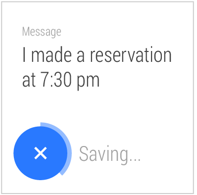
Where tapping on an action button results in an action being executed, one of the following can happen:
- The action is completed immediately and the result of the action is shown (either by updating the relevant card contents immediately, or by showing a confirmation animation).
- A short countdown animation to completing the action is played, which the user can interrupt to cancel. Once the timer has counted down, a confirmation animation is played. This animation can be custom-designed by developers.
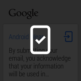
- A confirmation step is required. This is for actions that are potentially damaging if accidentally triggered. A generic confirmation template is supplied by the system. Once the user confirms, the standard confirmation animation is played.
- The cue card can be invoked to continue specifying the action. For example in a messaging application, tapping a “Reply” action button invokes the Cue Card and prompts for voice input. In this case the prompt label (such as “Speak your message…”) and a set of sample voice suggestions can be specified by developers.
Developer Docs
Showing Confirmations
Continuing activities on phone
Developers should attempt to perform actions on the wearable device wherever possible. In cases where the phone must be used, a generic animation should be played once the action button has been tapped and the corresponding Android app will open on the phone.
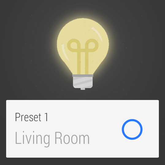
Actions on cards (such as media controls)
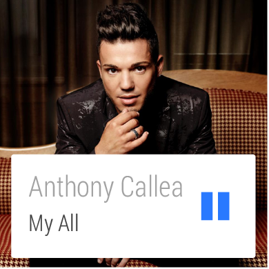
Some cards may benefit from having tappable actions directly on a card. Some guidance on when to use this pattern versus using an action button:
- This pattern should be used when only one possible action could be reasonably expected. For example, tapping on an address with a car icon and ETA seems like it would very obviously launch directions. Conversely, if you see a contact's photo and name, it's not clear what tapping would do (call them? email them?), so the pattern shouldn't be used in this case.
- On-card actions should not require a text label to be understood.
- On-card actions should only result in something happening on the wearable (apart from web links to open them on the phone).
- You should only have one action per card.
- Do not put menus on a single card.
Good examples of using an action on card include: play and pause music, toggle light switch on and off, navigate to an address, and call a phone number.
Developer Docs
Creating Cards
Card stacks
Card stacks group related cards together and allow them to be progressively expanded vertically in the stream. A tap on a stack fans the cards out so that the top edge of each card can be seen. A subsequent tap on a fanned card reveals that card fully. Stacks of cards revert to a fully collapsed state once the user has swiped away from them.
Developer Docs
Stacking Notifications
2D Picker
A 2D Picker component in your app can be invoked from the cue card or from an action button. It allows users to choose from a list of items, and optionally select an attribute of each item. For example, for a social check-in app, you could show a 2D Picker with a vertical list of places to check-in to.
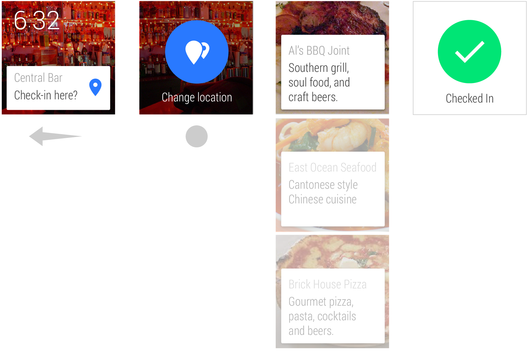
In some instances, further information may be required. In these cases, the most probable default values for these choices should be chosen on the user’s behalf with the option to edit before completing the action. This pattern is in keeping with Android Wear’s core design principle of minimizing interactions required.
More information about how to use the 2D Picker pattern is provided in the App Structure guide.
Developer Docs
Creating a 2D Picker
Voice commands

It is possible for apps to take action in response to Android voice commands that invoke intents. For example, an app can register for the “Take a note” intent and capture the subsequent voice input for processing. In the case where multiple apps registered for the same intent, user preference will be captured once and saved. Users can edit their intent preferences in the Android Wear app on their handheld.
Developer Docs
Adding Voice Capabilities
Selection List
Choosing an item from a list is a common interaction. The Selection List pattern (available as the WearableListView component) creates a simple list optimized for ease of use on a small screen where the focused item snaps to the center of the screen and a single tap selects. This widget is recommended as a common pattern for selecting items. It is used throughout the system UI, including in the list that can be accessed by swiping up on the cue card.
Of course, it is possible for Android Wear apps to extend themselves beyond the familiarities of these patterns. For a deeper look at the options available, see the App Structure guide.
Developer Docs
Creating Lists